Tuesday, May 31, 2011

My Holey Little Secret

I have a confession:  pictures of my living room and nursery have been seriously doctored.

I had some pretty holey walls due to all of the re-arranging of art I've done in the two rooms.  I was too lazy to fix them before I took "after" pictures, so I "fixed" them with Photoshop.

This is the picture I posted of the living room shelf:

And this is what the wall actually looked like:

This is the picture I posted of the curtains in the nursery:

And this is what the wall actually looked like:

Patching up those holes is the one thing I got done this past weekend.  I had the help of two new-to-me products.

Product #1:  Erase-A- Hole

I saw this in the June issue of House Beautiful.  It was in their list of 100 things you can find at a hardware store.  Whoever thought of putting drywall filler in a deodorant dispenser is a genius.  It was so easy to use and my newly filled holes are nice and smooth.  At $6.99 it's more expensive than filler that comes in a tub or tube, but the result and ease of use was worth it.


Product #2:  Miniature Clear Paint Cans

I got two of the smallest cans so I could have small amounts of touch up paint on hand for these and any future holes I will need to patch.

One of the things that was holding me back from patching up those holes in the first place was the fact that I had to lug out huge cans of paint with lids that were most likely stuck to the can.  These are teeny and the lids come off pretty easily (not too easily though).

I'll probably be using both of these products a lot in the near future.  Now I have no reason to put off patching up the holes that will be revealed when I start moving things around in other rooms.

How 'bout y'all?  Do you have any mundane, but necessary tasks that you just can't stand to do so much that you put it off and post Photoshopped pictures to "fix" your problem?  No?  Just me? 

Monday, May 30, 2011

Uh-oh

Uh-oh.  I made it through an entire three-day weekend and I hardly got a thing done.  Even though I barely got anything done in my house, I did spend a lot of time with the little man who's face planted in the grass in the photo above.  Just a side note... he totally did that on purpose.  I'm not quite sure what he was trying to do though, perhaps downward facing dog?

Anyway...between getting very little accomplished this past weekend and having a very busy week ahead at school, it may turn out to be a slow week here at The Thrifty Abode. 

Stick with me...I've got some ideas brewing that will hopefully turn into completed projects pretty soon.


Saturday, May 28, 2011

Three Day Weekend!

I've got a lot on my to-do list for this long weekend.  These are some inspiration pictures that I found via Pinterest that are just making my list even longer.

via
via
Let' see if I actually complete these projects that I have in mind.  Either way I will definitely be spending a ton of time with this little fellow.


Have a happy thankful Memorial Day!

Thursday, May 26, 2011

Seriously Craving Some Beautiful Organization

I kind of hate spending money on things for my house that nobody will see.  Yaknowwhatimean?  Very few people will ever go in my pantry, laundry room, or closets so usually I think, "Who cares what it looks like?"  As long as I can get to what I need and they're relatively clean,  I'm fine with them. 

I rarely spend much time or money dressing my storage spaces up.  Pictures like these make me think the money would be well worth it and that I'd enjoy chores a little more and keep things a little lot more tidy if I had storage that was this pretty.

via
via

via

via
via
via

Thoughts?  Have you done a storage beautification project that was totally worth it?

Tuesday, May 24, 2011

Here's what I'm thinking about....

...this chair.  I have this rocker in my son's nursery.  It's a brown mass amongst the other brown masses that are my crib and changing table.
 
I think it would be a lot cuter if it was kelly green.

I'm thinking about buying the beige slipcover that's available and dyeing it.  If anyone has tips, experience, or words of caution or encouragement when it comes to dying fabric, I'd love to hear them.

Monday, May 23, 2011

No-Sew Striped Curtains


I'm finally finished with these curtains!  I got one panel finished about a week and a half ago and I put the second one off because (like always) the first one took longer than I thought it would (I'm also a pretty big procrastinator). 

These babies are phase one of my nursery switcheroo.  (I just started, so that's why there's art still hanging behind the curtains.)  I made the curtains to fix the window mistreatment situation that was going on in my son's room.  Before I hung these panels I had a hideous tan, black-out curtain on a tension rod.  It was always meant to be temporary, but it ended up staying in the room for way too long.  Since we still needed the windows to be darkened, I attached the black-out curtain to the back of one of my new panels.

I hope no one is looking for an in-depth tutorial because I made a big oops.  I could have sworn that I took how-to pictures when I made the first panel, but as it turns out, I didn't.  Of course I didn't realize this until I was completely finished with the second panel!

Oh well, it's not that big of a deal.  If you want to create striped curtains without busting out your sewing machine simply cut strips of fabric and attach them to a curtain panel with Heat n' Bond or Stitch Witchery.  My stripes are 10 inches and I used a yardstick to keep them even when I creased the edges with an iron so the raw edges wouldn't show.  It's that easy.

I used a $20 pair of 98" Rivta curtains from Ikea, a $10 black-out panel (that I already owned), a $5 navy flat sheet from Wal-Mart for my stripes,  and 3 rolls of Stitch Witchery.  All in all these curtains cost about 40 bucks.

Although I declared that I was finished with these curtains at the beginning of this post, I actually have one more thing to do:  baby proof them.  I bought two packs of curtain ring clips for these panels, but I could only find one of them when it came time to hang them.  Since I needed to take pictures I just went ahead and hung them through the tabs.  The rings are great because if Little Man decides to pull on them, only the curtain will come down instead of the rod and hardware.

I snapped this picture just minutes after I hung them up.  I'm off to find those rings!


I'll be linking up to:


Coming Soon...

....DIY no-sew striped curtains.  I took pictures of my completed curtains last night and they didn't look that great because I had to use he flash.  I'm gonna take pictures this afternoon with day light and hopefully they'll come out better and I'll post them this evening.

Until then, here are some beautiful pictures of horizontally striped curtains.  Mine are going to be in our nursery, but as you can see they're great in any room.
via
    

via


via

Thursday, May 19, 2011

Two Things I Love

via
I found this via Pinterest and I've decided that I need it in every bathroom and storage closet in our house.


Also, these are uh-mazing.  I'm a bit addicted.

Forgive me for my lack of projects, I'm still getting back into the swing of working and getting stuff done around my house. 

Maybe I'll get something done this weekend.  Thank goodness it's almost Friday, y'all!  Enjoy the rest of your Thursday!

Tuesday, May 17, 2011

Hi/Lo: Natural Fiber Indoor & Outdoor Throw Pillows

Sisal, raffia, and even paper (there's also a faux one or two in the mix)!  I'm loving these pillows that would look great in a sun room or by a pool.  Can you put them in order from least to most expensive?!  The source list is below and I put the answer in the comments.


Source List:
1.via 2.via  3.via4.via5.via 6.via 

Most of the pillows came in multiple sizes so I let the price of the smallest pillow determine the lowest price.

Monday, May 16, 2011

Hi Ho, Hi Ho...

it's back to work I go.  I've had a wonderful three weeks at home with my little boy.  It's been so nice to pretend to be a stay at home mom and chip away at the massive list of things I need to do around my house.

Of course I didn't get as much done as I thought I would (I never do).  I have a lot of projects that are half finished and some projects that didn't even get touched and are going to be put off even later.

Over a week ago I hinted at a few things that I was working on.  Here are two (of four) that actually got finished.

My husband painted the hand rail going up the stairs from our living room.  I literally sat on the couch and he did the whole thing.  It was awesome.  Definitely the best DIY experience of the last three weeks.


We (I helped this time) also got our powder room painted.  Neither of those pictures is any good, because it's basically a black hole with no natural light. 


This one is a bit better.  We changed out the towel bar from a builder-grade ring towel holder to a slightly better $7 brushed nickel bar from HomeGoods.  The mirror is something we had sitting around.  We bought it for $15 at a flea market years ago.  The powder room may not be its permanent home, but it definitely looks better than the oval beveled mirror. 

I need to come up with a plan for accessories and possibly new hardware.  Even though I'm not set one the mirror or towel bar, I love the color we chose.  It's Sherwin Williams Hazel and it's a little less aqua than it looks in the pictures and a lot more like the color in the curtains in our living room.

Since I'm going back to work, posts may get a little sporadic.  I'm going to try to do at least 3 per week.

Have a great Monday!

Friday, May 13, 2011

Guest Posting at Remodelaholic and a Couple Additions

I'm glad that Blogger is up and running again.  In case you missed it yesterday:

I'm super happy to be guest posting at Remodelaholic.  Click on over to check it out.

I've also made a couple additions to my living room:
This little birdie was $5 at Tuesday Morning and I think he looks right at home on my shelf.

This huge sisal basket was $17 at HomeGoods.  I'm really excited about it because it looks a whole lot like this one, but it cost about $60 less.

Wednesday, May 11, 2011

The Rest of Our Thrifty Abode Part II

Our tour continues today with the second and third floors of our house.

Disclaimer:  You are about to see some mess.

Here's how our second floor is laid out:
In the last post I mentioned how we had a lot of wall space and hallway in our house.  See what I mean?  Only two windows on the whole floor.  It's not really that noticeable until you start decorating and there are big open expanses of wall to fill.  Other than that, having so few windows is not problematic and the window in each room does a good job of giving enough natural light.

This hallway leading to the two bedrooms is my arch enemy #2.  It is the catchall space for everything that doesn't have a home of it's own (or that I'm too lazy to put in it's place the second I'm done with it).  The laundry room is also just to the left, so piles of laundry (I think you can see a little bit of one in the bottom left corner) end up in the hallway.  There's a full bathroom to the left before you get to the two bedrooms that's a lot like the powder room on the first floor.  I haven't done and thing to it.  It's pretty far down on my priority list so I didn't even bother taking pictures of it.

My main goals for the hallway:
-find a way to keep it clutter free
-gallery wall of family photos between the laundry and bathroom


This is the room on the left, the nursery.  I'm currently in the middle of re-doing most of it.  I'd had it mostly finished, but we kept having issues with the window treatment.  The old one had to go because our house is east-facing, so we really needed a way to black out the windows in order to have successful naps.  Plus my previous curtain looked way too matchy-matchy.  What's in the room right now is one panel of my DIY sun blocking, striped curtains (I will be posting a how-to in the near future as soon as I finish the other one).

Here's what I have in mind to get this room finished up:
-finish the other curtain panel
-finish the art work above the crib
-put a gallery wall on the wall with the changing table
-find somewhere to hang my Ikea shelves since I put the ones that were in the nursery in my living room

This is how it used to look with the shelves and old window treatment in case you're curious:


The bedroom to the right is our guest room.
Yikes, right?  This room is the most neglected space in the house.  It used to be our office with a daybed, but it's mostly served as a giant closet.  If we don't know what to do with something, it goes in that room.  Every few months or so I have to reorganize all the clutter that's found its way there. I'd love for this to be a beautiful and inviting guest room someday, but I don't really have a specific plan in my head yet.  I almost don't want to do too much because by the time I'm finished we may have to use this room for baby #2. (which may still be years away... I'm just that slow at decorating)

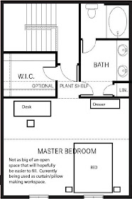
Our third floor makes up for the fact that our first floor living space is so small.   Our master suite is pretty huge and it takes up all of our third floor.

We've just recently started to really live in this space.  We used to just sleep here, but now that our office stuff is in our master suite we're really making the most out of the square footage.

This is how the furniture used to be laid out:
Our queen size bed looked so small and lost in our huge room that I decided to break the room up into two distinct spaces and move our office furniture from the guest bedroom up into our bedroom.

This is how our furniture is laid out now:

There really isn't much to show in this room.  I only have one picture of the bed so you can kind of get a feel of the colors I'm working with.

As you can see I'm working on picking a paint color.  Still haven't decided.  This room is kind of overwhelming because there is so much of it.

These are my ideas so far:
-paint the walls
-new window treatments
-chair, ginormous mirror, and rug for a sitting/changing area
-new night stands and move those to the guest room
-put stuff on the walls

Well, that's it.  Our little, awkward, practically windowless townhouse.  I hope you'll stick with me as I jump from room to room to get the place decorated!

Tuesday, May 10, 2011

The Rest of Our Thrifty Abode Part I

I'm still moving pretty slowly on some of those projects I was working on over the weekend.  I'll have more to share later.  Until then I thought I'd give a little peak into the rest of our home since I've only shown the living room.

We have been in our house for almost three years and it is nowhere near being "done."  I held out showing off our living room until my re-vamp was over, however, for the rest of my house, I'm going to bring y'all along for the ride...incomplete rooms and all.  I don't have a specific budget or timeline to work with to complete each room.  I'll probably be jumping around from project to project, room to room. 

Let's start with the outside of our little townhouse.  Here it is:

Our townhouse is built in a big building of other townhomes and they're back to back.  Our unit is not on the end so this means we have 5 (I can count them on one hand) windows and a whole lotta wall space.  It also has three stories which means we have a whole lotta stairs and hallway.  The square footage of our house doesn't sound bad on paper, but because it's so split up over hallways and different stories, our house feels a lot smaller than a one story house with the same square footage would.  I don't have the measurements on each room on the layout below, but when you see the pictures, you'll see how small it is.

This is the layout of our first floor (notice the 1 window). I've made the most progress with this floor, because it's the floor that guests see.  (One of the positives of having so many floors is that I usually don't have to worry about 2/3 of my house being perfectly clean when people come over.)


I didn't bother staging for these pics so excuse dog and baby toys.  When you enter the couch is to the left and our (teeny tiny) dining area is to the right.

The living room is to the left.
and the dining area is to the right.
Thank goodness the living room is finished.  The dining area, on the other hand, needs some help.
Here are some things I have in mind:
-I've had that mirror for almost two years and I've been meaning to frame it
-find a different light fixture
-maybe add a runner or table cloth
-possibly cover the chairs


The kitchen is at the back of the first floor.  I already changed the prints in the gallery wall and painted the letters above my cork board, now all I have to do is change out a few other accessories in the the kitchen.  I'm also looking for another drawer pull for the our little cart.

This counter between the kitchen and the dining area is my arch enemy.  I'd love to find a way to keep it clear, but I'm afraid it will always be filled with clutter.

This is what the powder room looked like on Friday.  It looked exactly the same as it did the day we moved in.  I hadn't done a thing to it.  We changed some things up over the weekend and I'll share those later.

So that's the first floor.  The small living space is sometimes an inconvenience, but in day-to-day life it's not a big deal and it's been a great starter home so far.

To keep this post from getting too long, I'll get to the second and third floors tomorrow.  There's a lot to do up there.
 
Have a great Tuesday!